Designing for friction to achieve 80% creator verification
I owned redesign of the creator verification experience, transforming a mandatory compliance requirement into a trust-building experience. By strategically staging friction and increasing transparency, the redesigned flow achieved an 80% verification completion rate after launch.
Role
Product Designer
Timeline
2 Months
Team
1 CEO, Co-Founder
1 CPO, Co-Founder
1 CTO
3 Engineers

Overview
Context
Leadership made a non-negotiable pivot to authenticate creators through Stripe Identity.
Fanspark, a sports creator platform, needed to verify creators before they could post content and monetize to prevent fraud and maintain compliance. We had to replace social authentication with a new, mandatory Identity Verification requirement using Stripe Identity.
The Problem
Mandatory, upfront identity verification is an incredibly high friction requirement.
Identity verification required creators to submit a government ID and take a selfie, introducing significantly more friction than social authentication, which is familiar and low-friction.
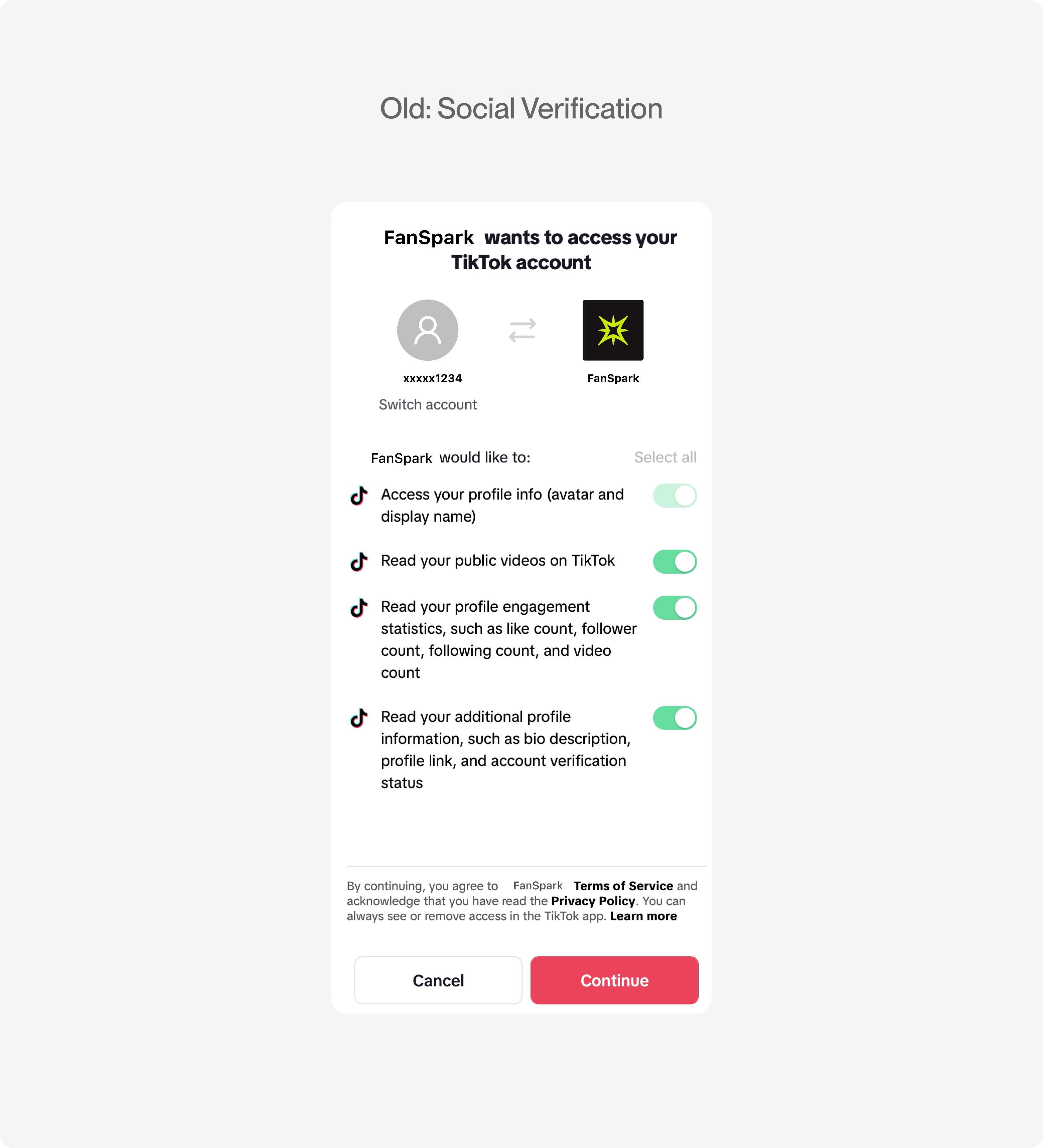
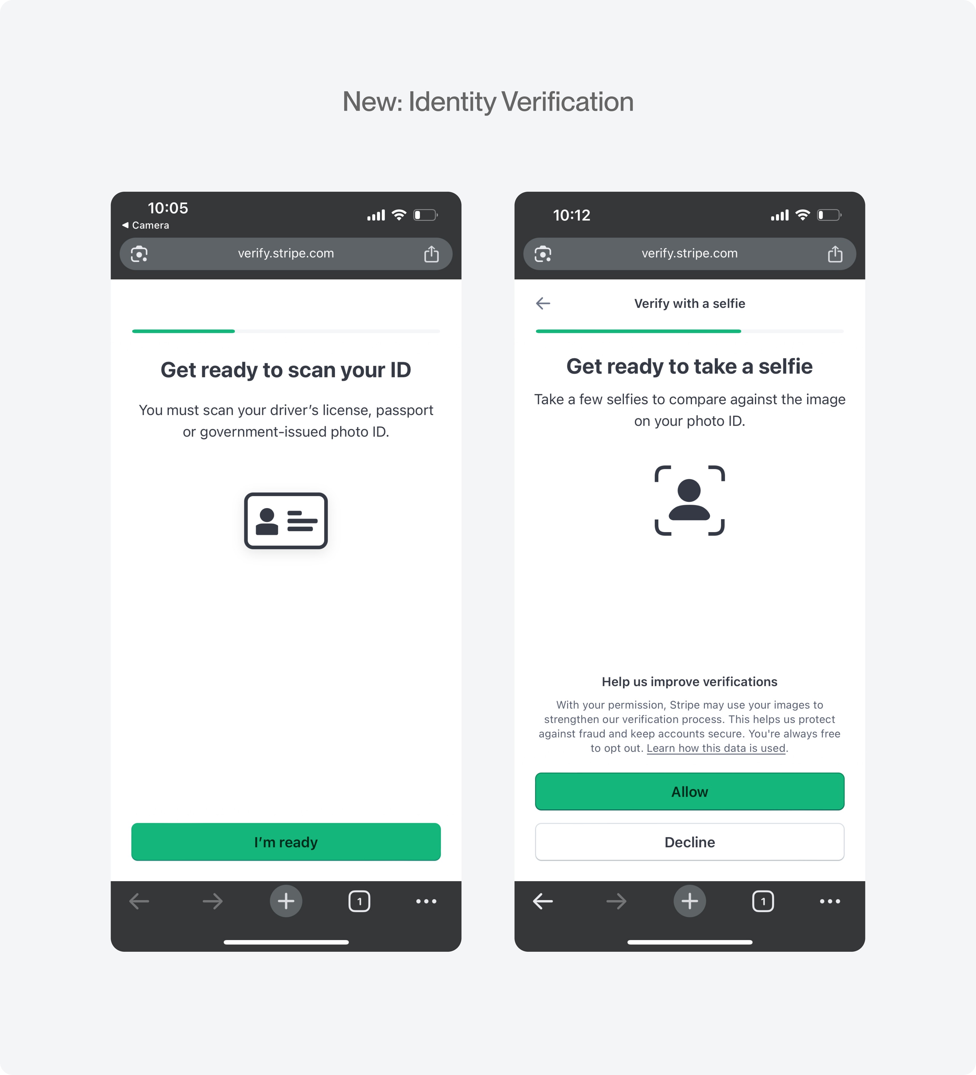
All-or-nothing gating early in the onboarding experience introduces risk of drop-off.
Creators are required to verify after sign-up. This timing plays a big role in the level of trust users have in the platform. Creators are brand new, trust is being formed, and now they're asked to provide highly sensitive information.

User journey of the creator onboarding experience
The Challenge
Make a mandatory compliance wall feel like a transparent, trustworthy onboarding experience
I shifted my design focus to implementing Stripe Identity and designing around the surrounding experience. I focused on clarity, transparency and friction reduction.
With ID verification now required, I had to balance competing needs: make the experience feel trustworthy and easy to navigate for creators, while preserving the verification requirements needed for fraud prevention and compliance.
The Solution
Designing the surrounding experience
ID verification was a non-negotiable business requirement but this all-or-nothing gating in the early creator experience introduced risk.
Insert the full prototype here
Constraints
Third-party dependencies
Stripe owned the identity verification experience limiting what could be designed
Non-neogtiable requirement
ID couldn't be removed or shortened, so the only lever available was how it was presented and sequenced
Results
Third-party dependencies
Stripe owned the identity verification experience limiting what could be designed
Non-neogtiable requirement
ID couldn't be removed or shortened, so the only lever available was how it was presented and sequenced
Define
Mapping the platform-to-Stripe interaction
I worked with engineering and product to understand how Stripe Identity worked and how it would effect the existing experience. It was important to understand the backend logic to design solutions that would influence what the end user sees. This was important because users would be completing verification outside of the platform and so many things could occur that we would not have much control of.

New user flow with Stripe Identity
Tradeoffs
URL redirect vs. modal overlay
A modal overlay would keep users on the platform but a URL redirect was easier to build. The risk of a URL redirect was that users would lose control of the context around it but it reduces how much private info we needed to store
Linear v. segmented verification experience
A linear process satisfied business requirement but risked users not completely verification so early on in the onboarding process
General v. specific error codes
There were so many potential error codes to account for and take time to design but I opted for the minimum approve and deny.
Third-party dependencies
Stripe owned the identity verification experience limiting what could be designed
Design decisions and implementation strategy
Design Decision
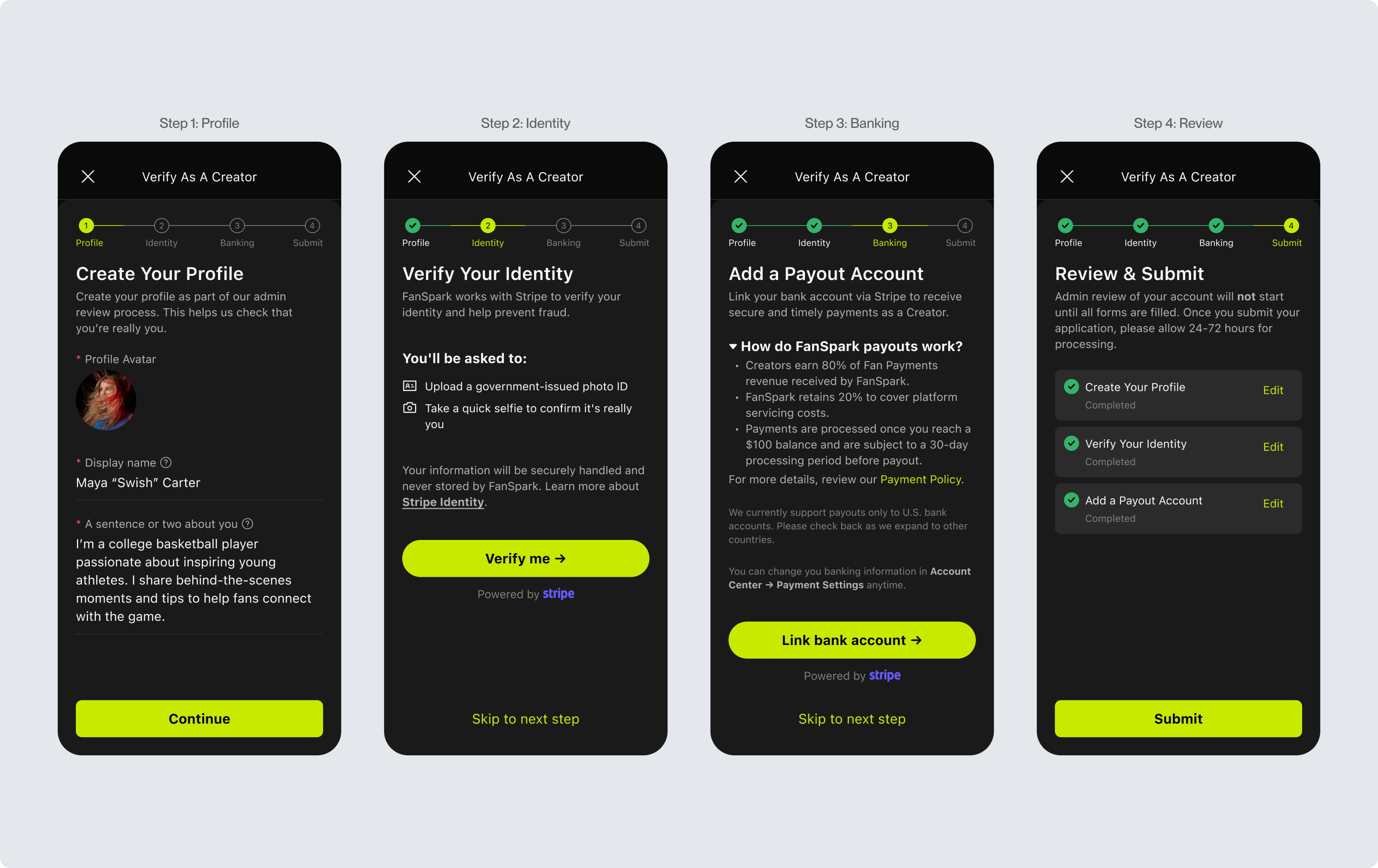
Re-ordered steps from least to most sensitive
Based on the sensitivity of the ID verification requirement, I reordered the verification process from least to most sensitive. The idea was to start with low commitment asks first, allowing creators to build trust incrementally before asking for a government ID and selfie.
Tradeoff: Verification was linear, but
Tradeoff: Verification was linear, but

Design Decision
Increased transparency around sensitive information
When friction is mandatory, ambiguity brings about skepticism and risks drop-off. I increased transparency and visual clarity by making it easy to skim and understand why each step was required and what to expect.
Tradeoff: A modal overlay would keep users on the platform but a URL redirect was easier to build. The risk was that creators would lose control of the context around it so it was crucial to set expectations before directing them off the platform and onto Stripe.

Design Decision
Accounting for the edge cases
I collaborated closely with engineering to map our application states to Stripe's real-time API webhooks, creating feedback UI for four critical edge cases.
Tradeoff: Errors were generic and not specific for this MVP. I planned to track the common specific errors on launch and use that data to determine which specific errors to prioritize.

Final Designs
A seamless and transparent verification experience
Creators verify their identity right after onboarding, handing off to Stripe Identity and return to Fanspark without losing context.
End-to-end flow map
One linear path from entry to confirmation. A segmented flow was considered and set aside for this initial release.
Update image to show which is Stripe and which is Fanspark
New user flow with Stripe Identity
Setting expectations before the handoff
Before leaving the platform, creators see what they'll need and what happens next, so the redirect feels expected rather than abrupt.
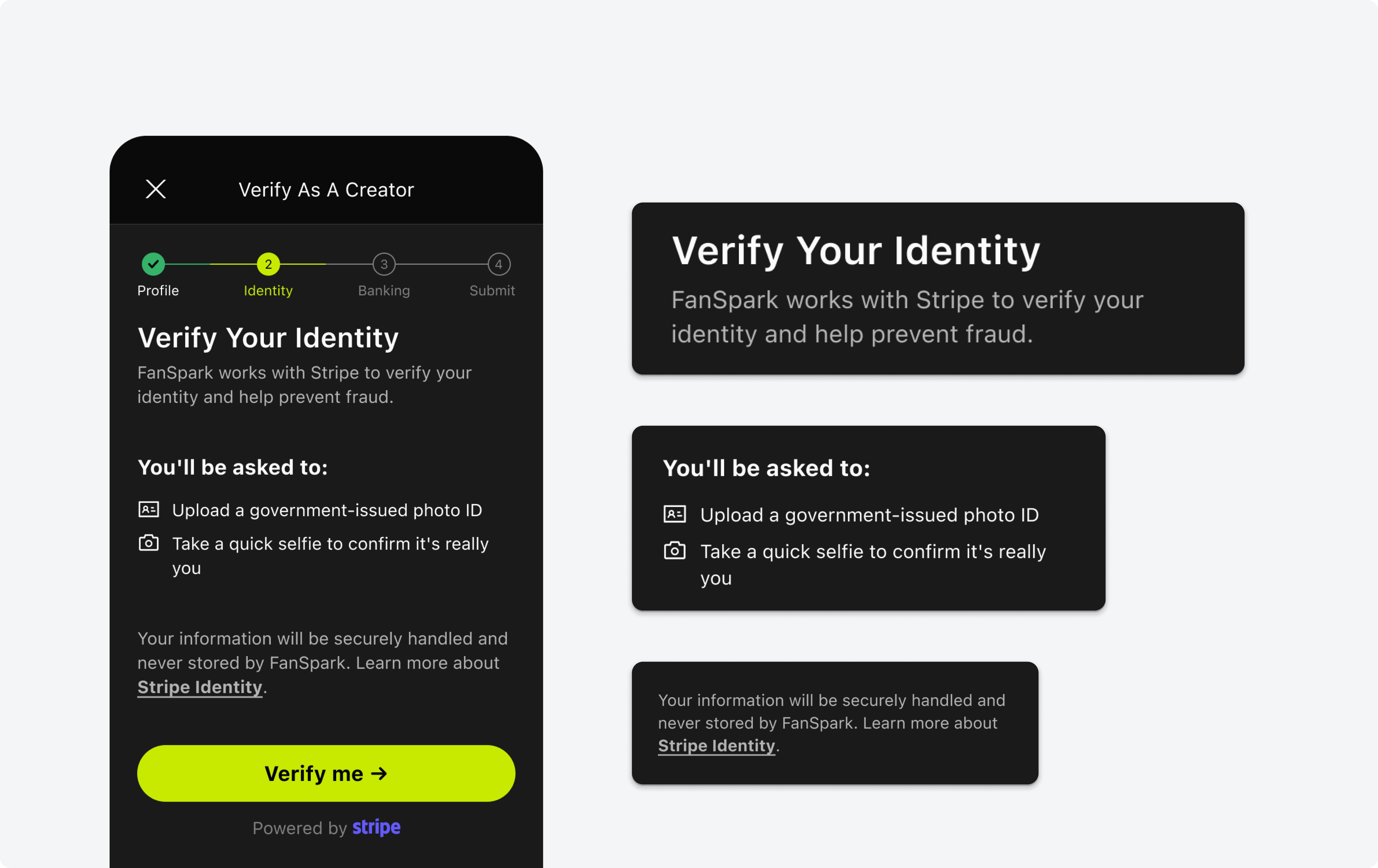
Platform-to-Stripe edge cases
Success, pending, process, expired and a generic error state that routes users back to Stripe to address the errors in greater detail.
Surface the benefit before the ask at the entry point
Led with what verification unlocks for creators, reframing the flow from obligation to value.
Add interaction with modal pop up with shiny on the badge?

Progressive disclosure to build trust
Add stepper with micro interaction of the checks being complete
Add review screen with different states
Validation
The flow was easy to complete, but trust varied by creator
Beta testing showed that creators could understand and complete the verification flow. However, their level of trust varied: some readily provided their information, while others were more skeptical about why it was required.
Since testing didn't reveal a usability issue with the flow itself, we shipped the design as planned and carried the trust considerations forward for future iterations.
Outcome
80% verification completion
The verification experience launch and achieved an 80% completion rate while maintaining the required identity verification process.
Reflection
What I Learned
Sometimes friction is necessary. When you're asking users to provide sensitive information, the design opportunity is to make that friction clear, intentional, and trustworthy without treating the user experience as an afterthought.