Doughrise (now Budgetwise)

Overview
Budgetwise, a personal finance and budgeting platform, wanted to redesign their core experience to drive user growth. The current platform's lack of intuitive workflows and cluttered interface made it difficult for users to track their finances effectively. This project focused on streamlining the core experience, reducing friction, and revamping the user interface for enhanced engagement.
My Role
Product Designer
Timeline
3 Months
Platform
Mobile App
Team
UX Designers x 3
Product Managers x 1
CEO x 1
Engineers x 2
Research Insights
Usability testing surfaced 3 key problems with the core experience:
Lack of clarity in core budgeting concepts
Manual and tedious user experience
The app's reliance on manual input and tedious processes make the budgeting process time-consuming and cumbersome, decreasing user engagement and satisfaction.
Cluttered UI with overwhelming data presentation
Streamlining user flows to reduce tedious and manual work
Taking insights from user research, I collaborated with the design team to map out comprehensive user flows illustrating the new user onboarding experience. We focused on redesigning the onboarding process to make it more intuitive and less labor-intensive. By breaking down complex tasks into manageable steps, we aimed to enhance user engagement from the very beginning.

THE SOLUTION
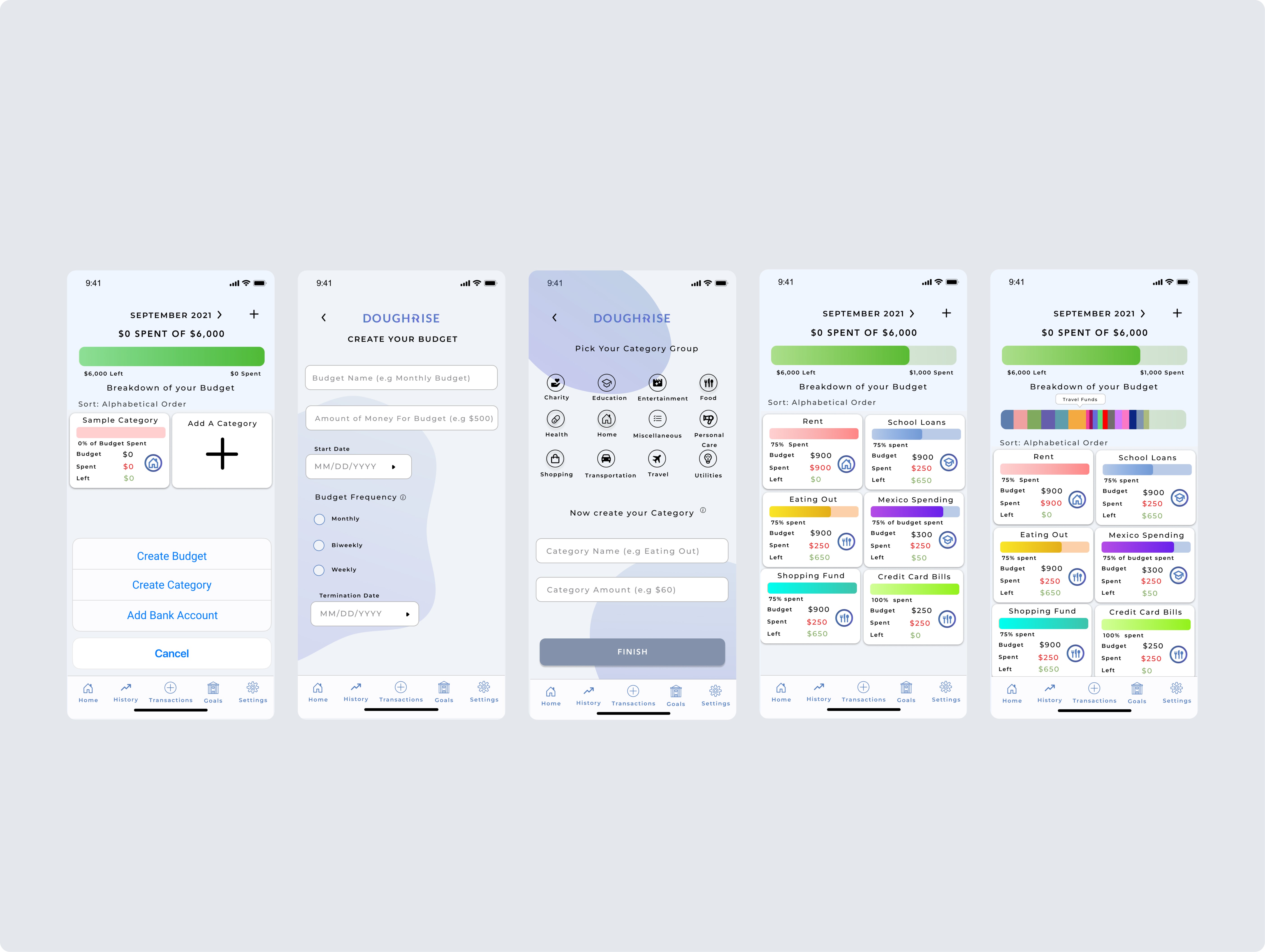
A new onboarding experience to educate users through the budget creation process
For a first-time user, a budget will default to monthly while still providing more advanced users the ability to create more detailed budgets to meet their specific needs. We also introduced account linking and mass creation options during the onboarding process while still providing the user an option to edit it later.

Redesigned budget dashboard
A clean, intuitive dashboard that provides users with a quick, high-level overview of their budget. By utilizing color psychology (green signals staying within budget and red signals overspending), we enhance visual clarity and communication.

Introducing Trends to help users improve their financial habits
We introduced a new feature called Trends to give users greater insights into their financial habits over time. Now users can see exactly where their money is going and identify areas to cut back or save.

Results & Impact
The changes implemented led to significant improvements in user engagement and onboarding success rates. Users reported feeling more confident in using the app, appreciating the streamlined experience and the newfound automation features.
We plan to continue iterating on our design based on user feedback and analytics data. Our next steps include:
Integrating machine learning algorithms to provide more personalized insights and recommendations.
Expanding our budgeting features to cater to users' diverse financial needs.